Widget
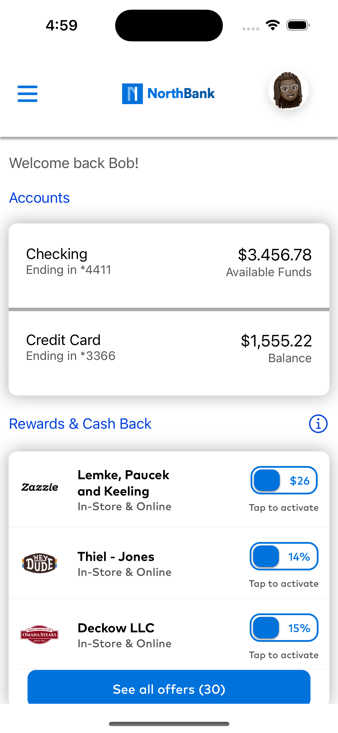
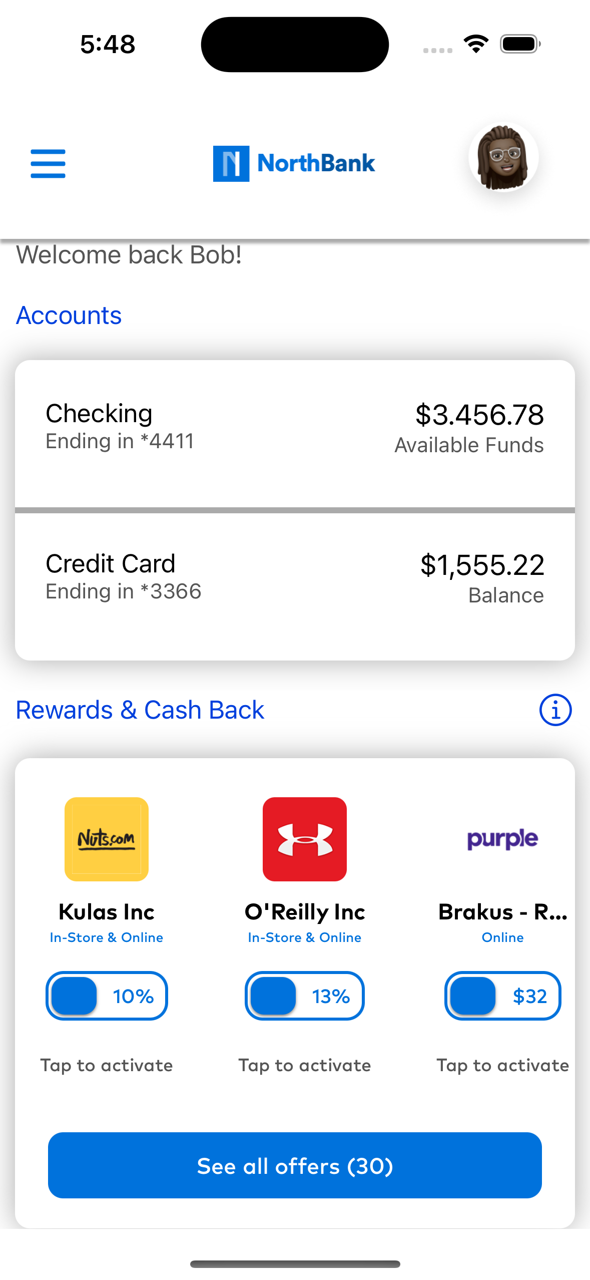
Partners can include a UI Widget in their own app experience as an entry point for consumers to view their rewards, encouraging engagement with rewards prior to entering the full screen reward experience. You can customize aspects of the Widget including but not limited to: it's display style and the animation for presenting the full rewards experience.


Integration
To create a CDLXOffersWidgetView you will need to pass the makeWidgetView method a widget configuration, which includes the style type of the widget you would like displayed. Additionally, you will have to include the presenting UIViewController for the widget to be able to open the Rewards Experience when tapped.
1 2 3 | |
There are two primary ways to include the widget in your app experience. Please make sure when including the OffersWidget that you include a widget style. For more information on how to change widget style, see Customizing Display Style
XML
1 2 3 4 5 | |
Kotlin
1 2 3 4 5 6 | |
Customizing Display Style
The widget supports three different style configurations to display rewards to a user. It can display rewards in a grid, a vertical list, or a horizontal list. See below for how to specify that configuration.
Using the style attribute on the CDLXOffersWidgetConfiguration you can use the options: basicGrid , basicVerticalList, or basicHorizontalList to change the display style.
1 2 3 | |
XML
Using the widgetStyle attribute you can set the: grid , vertical, or horizontal to change the display style.
1 2 3 | |
Kotlin
After having created an OffersWidget you can programtically change the style of the widget by calling the setConfiguration method and passing in a CDLXOffersWidgetConfiguration and setting the style variable using either: Style.Grid, Style.VerticalList, or Style.HorizontalList
1 2 3 4 5 6 7 8 9 | |
Loading Widget
Once the widget is integrated and ready for display, load the widget to display offers.
If the widget has successfully loaded offers, calling this a second time without setting forceReload will have no effect. If the widget encountered an error or loaded no offers, calling this a second time will attempt to load offers again.
Calling again with forceReload: true will always initiate a fresh load of the widget. Default value forceReload: false
1 | |
Kotlin
1 | |
Displaying Program Education Alert
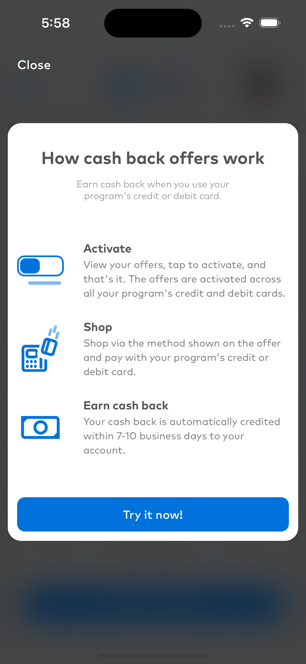
The widget offers support for the option to display a program educational alert without routing the user into the Cardlytics rewards experience. This can give the user more information on the rewards experience prior to entering that flow. This information can by configured real time with any SDK updates.

Presents the alert associated with the specified widget.
1 2 | |
Presents the alert associated with the specified widget.
Kotlin
1 2 3 4 | |
Customizing Rewards Experience Display and Dismiss Animation
The widget support two different animation style for presenting the Cardlytics SDK on iOS. First is the horizontalModal in which the Rewards Experience slides in from the right of the screen while the presenting view does not animate. Second is the navigationPush in which the Rewards Experience slides in from the right of the screen, while the presenting view is shifted slightly to the left. This mimics the presentation animation of a typical navigation controller.
To change the animation style please set the preferredNavigationAnimation in the CDLXOffersWidgetConfiguration object you create before instantiating the widget view.
1 2 3 | |
The default animation for showing the Rewards Experience is navigationPush.
To customize the animation for the entry and exit of the Rewards Experience you can provide your own XML View Animation.
XML
1 2 3 4 5 6 7 | |
Kotlin
1 2 3 4 5 6 7 | |